
Birch + Elm Branding

The Problem:
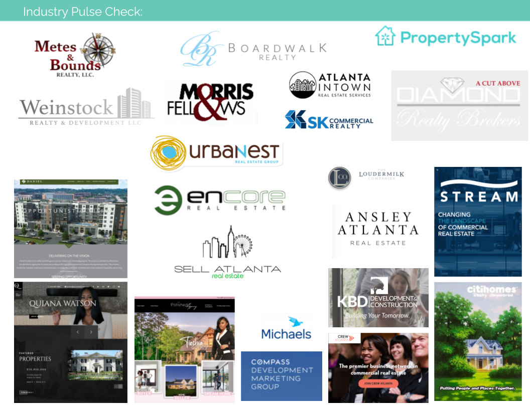
A new client came to me wanting to launch her new real estate company with premium branding before completing her first piece of business in the suburbs of Atlanta, GA. She needed to build a brand that would grow with her as her business grows to represent more agents across both residential and commercial real estate markets in years to come.
Our Focused Solution:
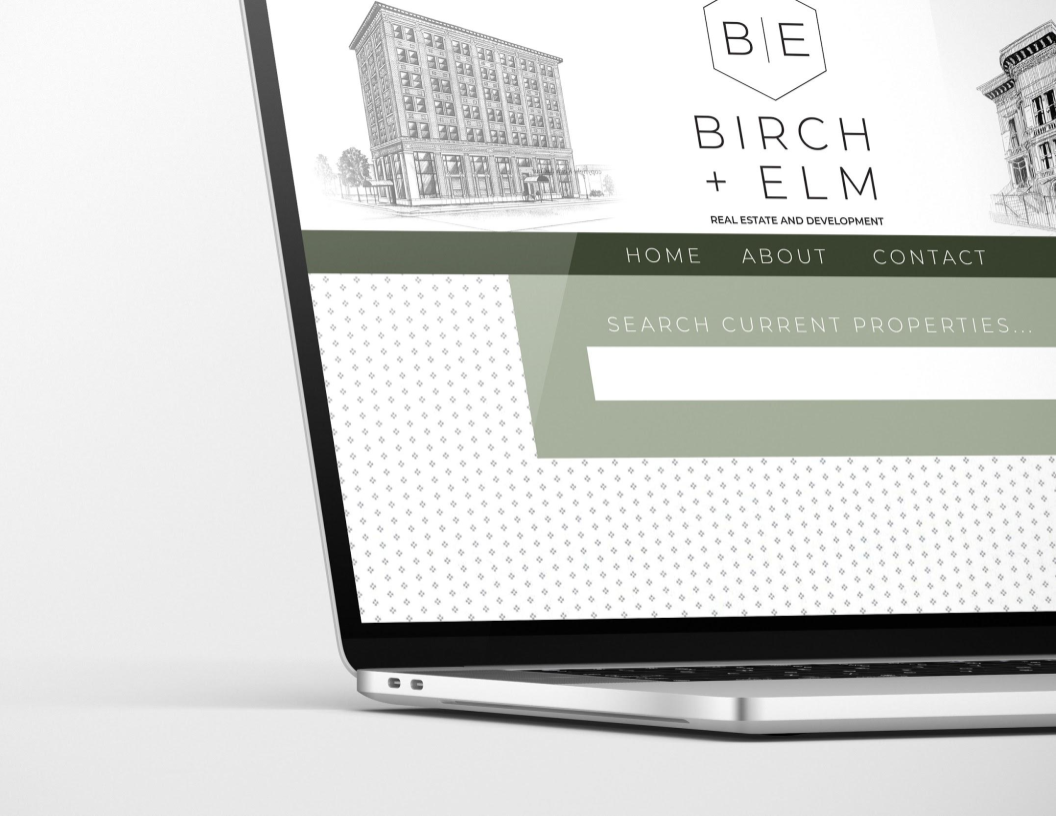
We settled on sans-serif fonts, a modern, muted color pallet and a simple graphic hexagon shape to own as the brand icon – loving how its angles abstractly cue a traditional A-frame roofline. Once the brand identity was complete, we applied it’s style guide to a consumer-facing website to act as a hub of information for anyone being introduced to Birch + Elm’s buying and selling process and services.
The branding project
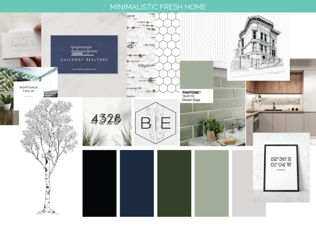
PHASE I - Logo Suite Exploration
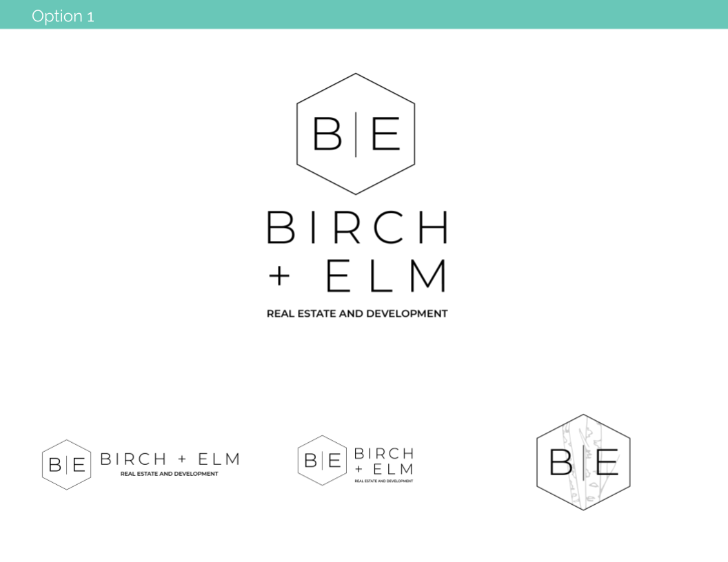
The client chose from 3 moodboard options to find the look and feel that made the most sense for her vision. The different elements she liked, helped me understand and decide upon photography and illustration styles, color pallet and pattern usage, etc; all informing the design of her logo. She chose pieces from several of the first round logos presented, allowing me to combine elements and develop the strong final logo that best represented her business.
We narrowed down the messaging points (using “we” vs “I” to talk about the brand) and wove in simple woodland references in the language and visuals.


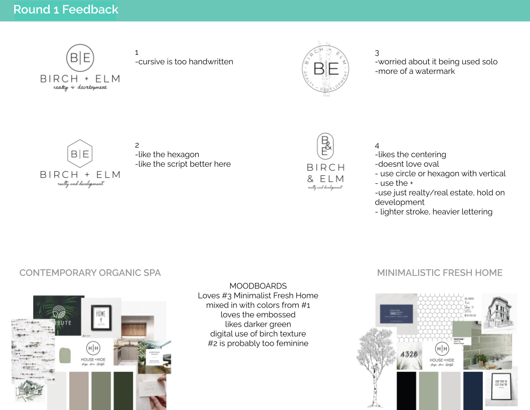

“We’ll help you see the forest for the trees and find just what you’re looking for.”
PHASE II+III - Brand Style Guide Development and Final Asset Hand Off
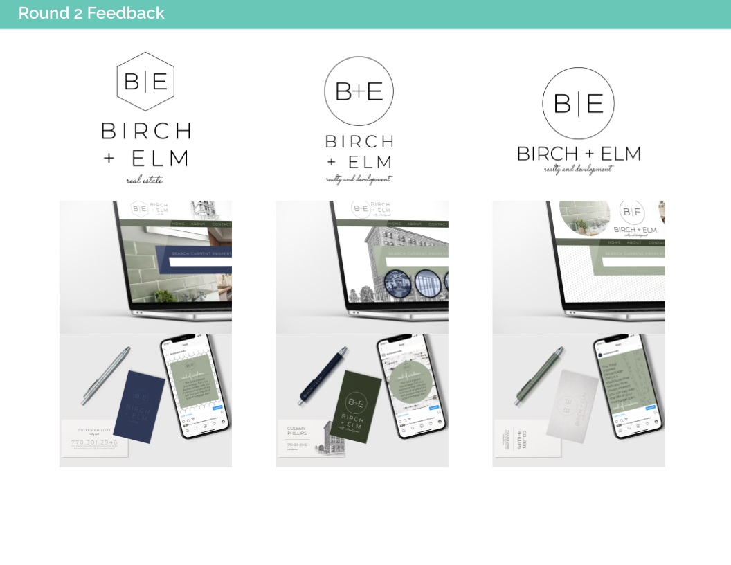
The design iteration process allowed us to explore different logo options, focus in on what worked for my client and what didn’t work; providing us with this final solution: using sans-serif fonts, a modern, muted color pallet and a simple graphic hexagon shape to own as the brand icon – loving how its angles abstractly cue a traditional A-frame roofline.
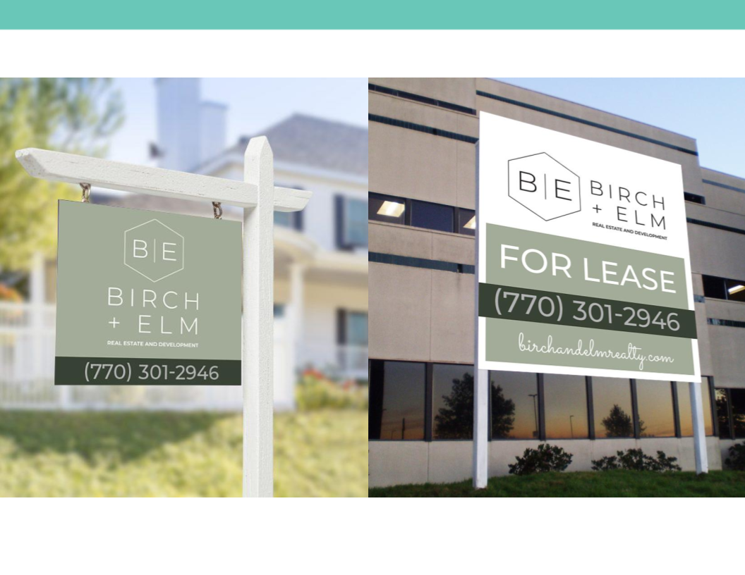
We finalized everything in a brand Style Guide and exported final assets that were ready for print and digital uses. Complimentary designs were prepared, including a business card design and social media profile images.
the website project
PHASE I + II - Kickoff and Site Design
We took all the learnings from our Branding project and applied them to the customization of a Squarespace website template. The functionality of this site only needed to serve as a lead generator and point of business contact information so the site tree was fairly simple.
Custom illustrations of commercial, residential and a Newnan, GA cityscape were commissioned to bring the suggested graphic styles from the Style Guide to life.


PHASE III - Site Launch and Ownership Hand Off
Just in time for my client to make her first sale, we pushed the site LIVE! The launch was strategically supported by social media graphics and templates set up in Canva for her to continue using her branding easily herself beyond our project’s end date. The site launched successfully and serves as a focused hub for Birch + Elm clients while helping to grow her business in the community and beyond!
